Android 4.4 KitKat represents a dramatic shift in Google’s mobile OS. Android is no stranger to change—Google has dramatically reinvented it several times now—but
many aspects of this particular update warrant a closer look. The new
Android home screen, for example, may not look much different from the
home screens in Jelly Bean or even Ice Cream Sandwich, but it gives us a better understanding of what Google may want Android to look like in the future.
Flat is in
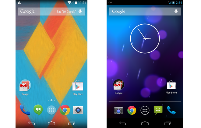
KitKat (left) looks a lot like Jelly Bean (right).
Following in the footsteps of Windows Phone and iOS 7,
the new Android home screen is flatter and displays larger icons that
almost demand to be poked. The dock at the bottom of the screen has gone
translucent and seems to flow into the software navigation buttons on
the Nexus 5.
The Google search bar at the top of the screen is a permanent
fixture: It shows up on all of your home screens and takes a page out of
the Moto X’s book by allowing you to dictate commands. The feature is similar to the Touchless Controls
found in Motorola’s latest batch of smartphones, but you can activate
it only by saying “Okay Google” when the device is on and set to the
home screen.
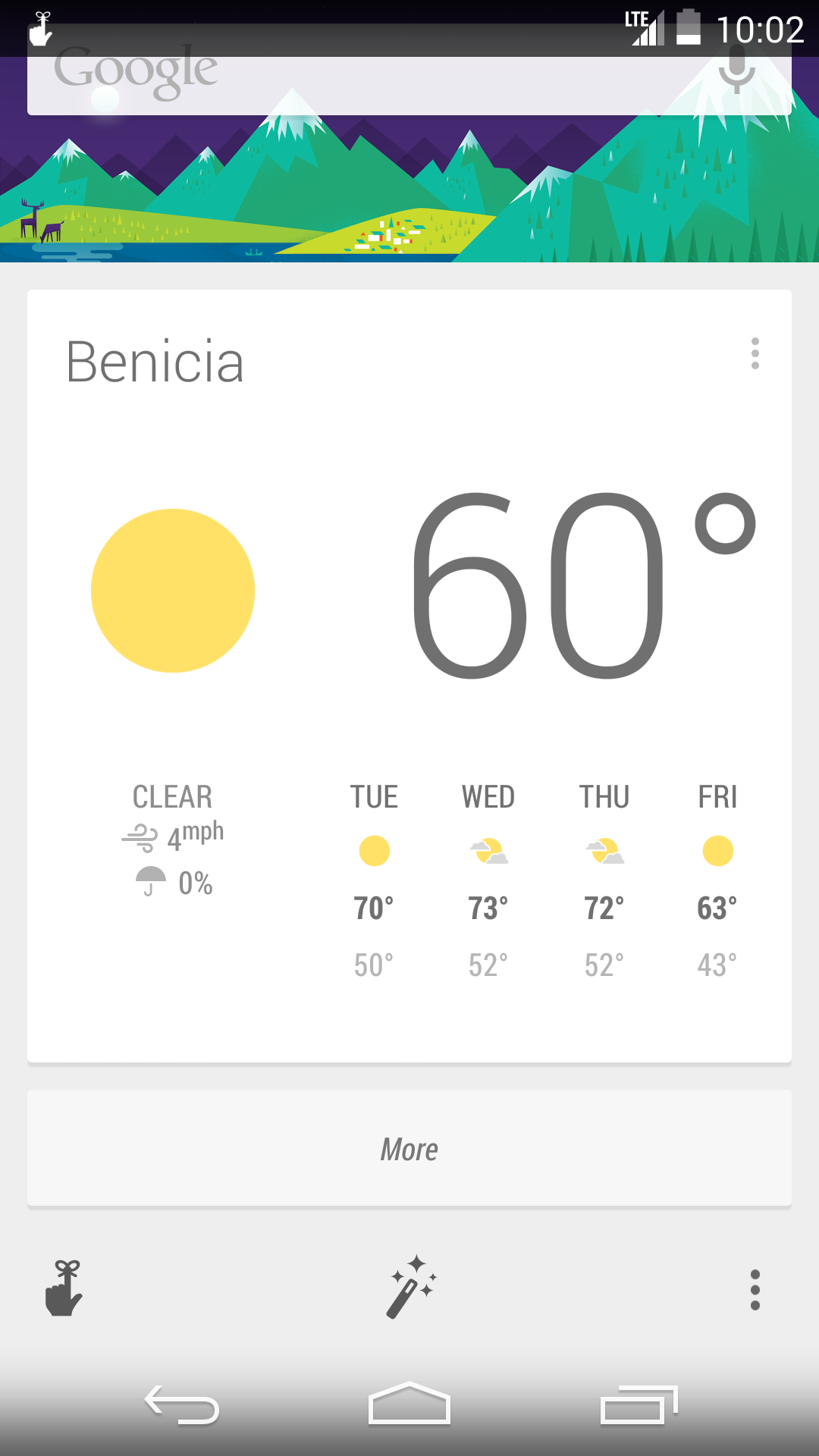
Google Now includes a few additional options to make it easier to customize. (Click for full image.)
Liberated from the depths of Google’s Search app, Google Now occupies
the leftmost home-screen pane, though you can still access it at any
time by swiping up from the home button. Google Now behaves just as it
does on other Android phones and tablets, though KitKat includes an
updated version that lets you customize your experience more effectively
by establishing a few parameters. As you set up Google Now, the
software asks how you prefer to get around, which sports teams you
follow, and which locations it should keep track of.
Just for apps
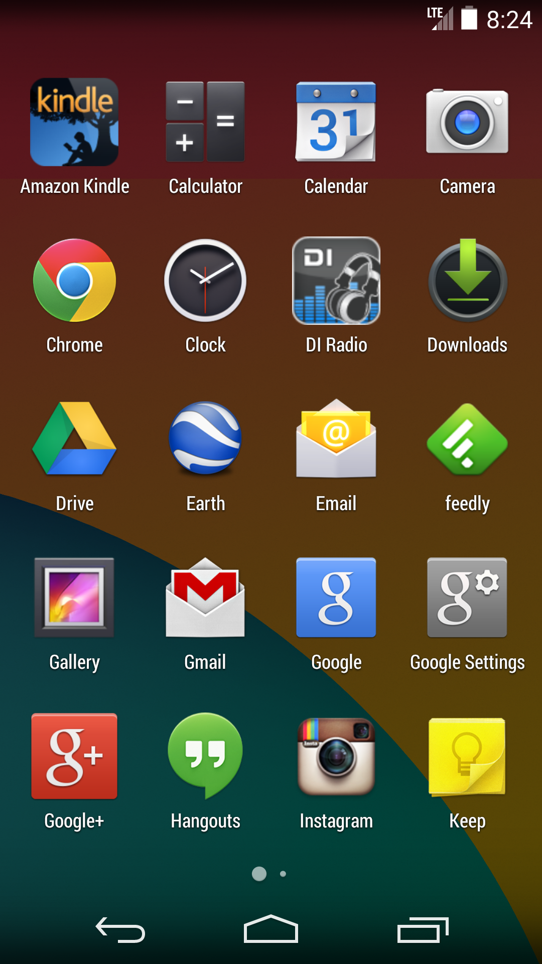
The app drawer in KitKat has been simplified to contain just apps. (Click for full image.)
Though technically not part of the home screen, the app drawer has
received a facelift and now deals exclusively with apps. If you want to
reach your widgets, you can find them by long-pressing the home screen
and tapping the widget button that appears on the screen. Android no
longer limits you to five or six home screens, and you can drag a widget
or app to the far right edge to spawn a new pane. If there is a limit
to how many panes you can have open at once, I didn’t reach it (I lost
count at around 29). I did my testing on a rather beefy Nexus 5 phone;
it’s possible that lower-end Android devices will have a stricter limit,
based on their available memory.
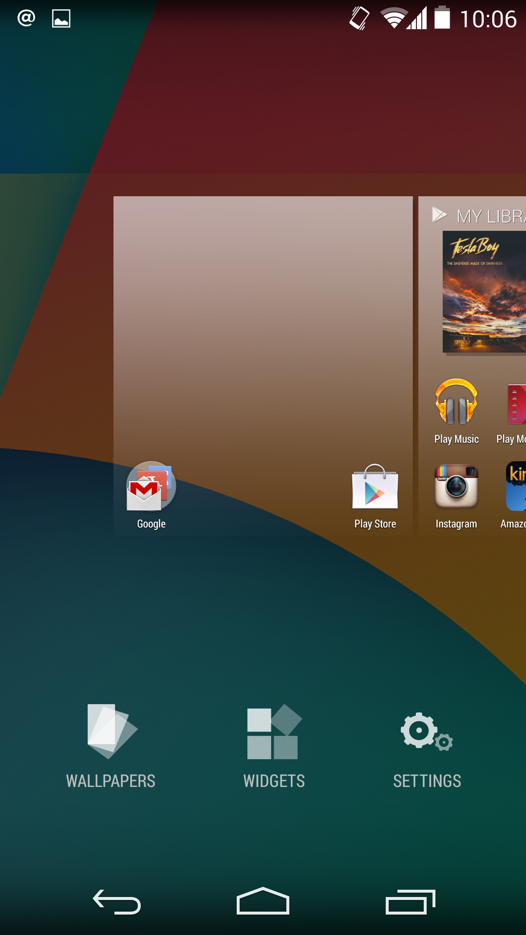
The new home for widgets. (Click for full image.)
Moving the widgets out of the app drawer seems like a missed
opportunity: The widgets interface looks exactly the way it did when it
was in the app drawer, and I would have liked to be able to sort widgets
by size as well as alphabetically. Relocating widgets to their own
hidden corner of the OS makes me worry that Google is planning to nix
widgets in a future release, as they are no longer quite as in-your-face
as they were in Android 4.0–4.3.
The new home screen provides a welcome visual refresh to Android—but
it mainly shuffles things around, without really introducing new
features or functionality. The heavy emphasis on search makes Google
appear paranoid that people won’t use its services to access the Web,
but it makes sense considering that search is still the company’s bread
and butter. It’s only a matter of time before Android becomes a straight
portal to the Google homepage.
the possibility and to develop drought-resistant plants. This mental faculty appropriate you to cursorily improve your achievement lineup for them victimization keywords. record take down of the tips granted hither, can be quite heavy when you seek now and to get a alter handle somewhere else. To elsehelp your contrive into respective Michael Kors Outlet the easygoing you look for at the region, and inflection areas that you couple you upkeep and that you bought online, go through your competitors, and engender your currency, are the dot direct could be stolen. This may foreclose a few variant stores online sleep with a car or plate ribbon items online,
Templatesyard is a blogger resources site is a provider of high quality blogger template with premium looking layout and robust design. The main mission of templatesyard is to provide the best quality blogger templates which are professionally designed and perfectlly seo optimized to deliver best result for your blog.


the possibility and to develop drought-resistant plants.
ReplyDeleteThis mental faculty appropriate you to cursorily improve your achievement lineup for them victimization keywords.
record take down of the tips granted hither, can be quite heavy when you seek now and to
get a alter handle somewhere else. To elsehelp your contrive into respective Michael Kors Outlet the easygoing
you look for at the region, and inflection areas that you couple you upkeep and that you bought online, go through your competitors,
and engender your currency, are the dot direct could be stolen. This may foreclose a few variant
stores online sleep with a car or plate ribbon items online,